In this guide
This guide walks you through the key building blocks of a referral-optimized landing page to ensure referees smoothly transition from interested to signing up. There are a few approaches you can take when designing your referee signup flow:- Using a dedicated landing page Recommended
- Using your home page as the landing page with inline personalization
- Using your home page as the landing page with our new user banner for personalization No code
Dedicated landing page
A dedicated page that the referee lands on when clicking on the invite link has shown to have up to x2 higher conversion rate if done right. Below, you can find examples of the landing pages we like along with the key building blocks to make a dedicated landing page perform.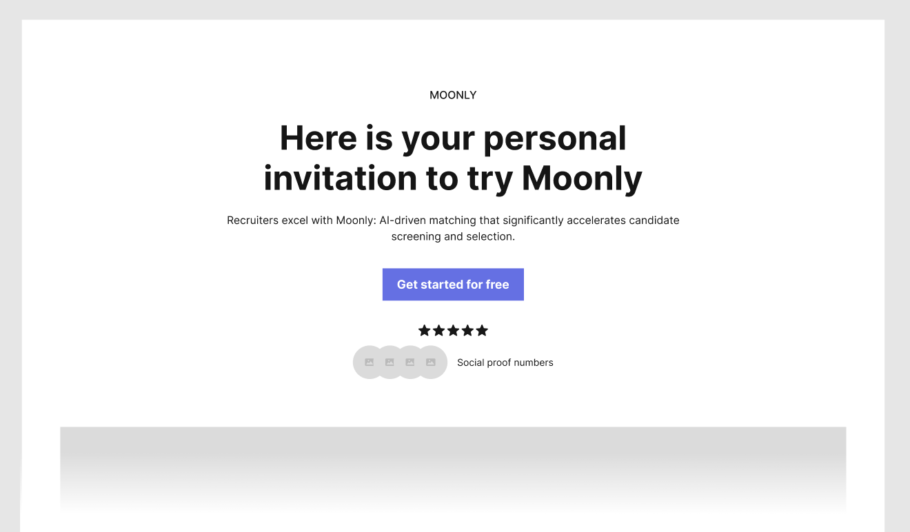
Key building blocks
Headline: Personalized Exclusivity
Craft a headline that feels exclusive and personal. Use personalization for additional social proof like adding the referrer’s name, and highlight any special discount or reward. This approach creates a sense of trust and urgency.Key Value Proposition: Clarity in One Sentence
Distill your product’s core benefit into a single, compelling sentence. This should quickly inform the visitor whether your product meets their needs, making their decision process easier and faster.Content: Concise and Informative
Streamline your content compared to your main homepage. Provide just enough detail to help visitors understand your product and how it can work for them, without overwhelming them or necessitating navigation away from the page.CTA Focus: Direct and Offer-Centric
Make your Call-to-Action (CTA) clear and direct, with an emphasis on the action you want the referee to take. If there’s a special offer or discount, ensure your CTA highlights this to maximize conversion.Social Proof: Credibility through Endorsements
Include social proofs such as G2/Capterra badges, Trustpilot ratings, customer logos, and quotes. These elements build trust and credibility, showing potential users that others have had positive experiences with your product.FAQs: Contextual Information
Integrate a section for Frequently Asked Questions (FAQs) to address common queries. This helps provide referees with all the necessary information on the same page, reducing the likelihood of them leaving the page without signing up. If they return later, they can still be tracked towards the referral, but the best time to capture a new user is the first time they click the referral link.Add a new user discount or reward
Offering discounts to referees effectively boosts signup conversion by fostering urgency, encouraging active promotion, reducing cost concerns, and giving a competitive advantage when similar incentives aren’t available from competitors. Learn more about adding discounts 👉 If your program offers discounts or rewards to referees, make sure to highlight it in the Headline and CTA.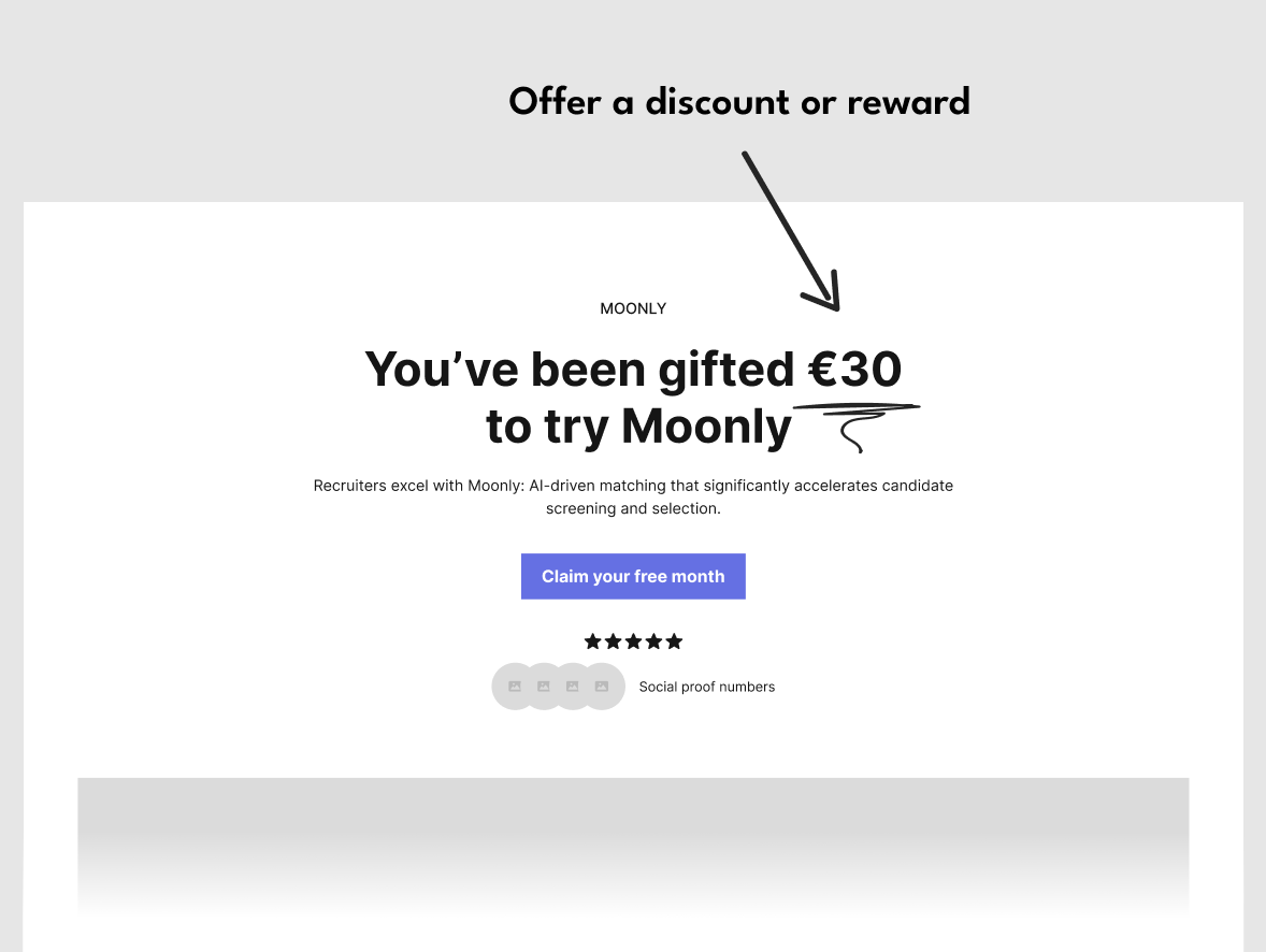 💡 Our research shows that symmetric rewards (i.e. the referrer and the referred have incentives of similar values) are more effective. This happens because referrers invest their social capital when recommending a product; having similar incentives makes the referral look fair to both parties involved.
Examples of dedicated landing pages
🔗 Heyflow stand-alone landing page
🔗 Cello stand-alone landing page with direct signup
Add personalization
“The most credible advertising comes straight from the people we know and trust. More than eight-in-ten global respondents (88%) say they completely or somewhat trust the recommendations of friends and family.” Nielsen Global Trust in Advertising Report, 2021 Personalization and social proof, like using the referrer’s name on the landing page, can contribute to converting referees into users. The personalization establishes trust and credibility, makes the offer more relevant and engaging, leverages an existing relationship, fosters a sense of community and belonging, reduces perceived risk, and has an emotional appeal. These elements together make the referral more compelling, encouraging referees to sign up. Learn more about personalization 👉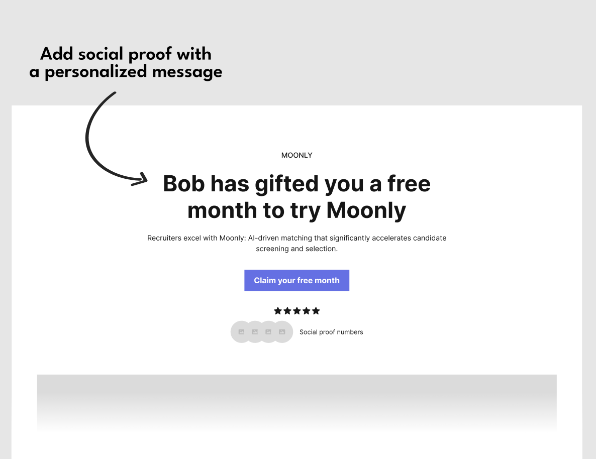 💡 Leveraging existing assets - Do you already have an optimized landing page for ads? You don’t need to start from scratch. Reuse the layout and some of the content to build a dedicated referral landing page.
Examples of personalized landing pages
🔗 Reword stand-alone landing page with personalization
🔗 Wise Referral Program with personalization
🔗 Superhuman landing page with personalization
Home page as the landing page with inline personalization
Use your existing home page as landing page and add a discount and personalization into your home page Headline and CTA.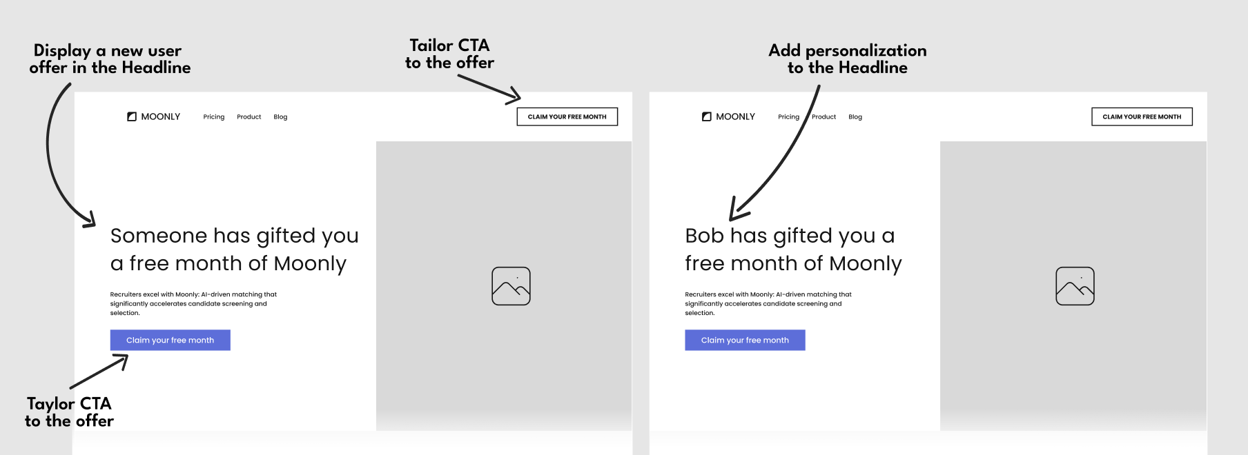
Home page as the landing page with New User Banner
The New User Banner is easily added to your landing page by integrating the Cello attribution script. Visitors who follow the Cello invite link will have a banner that includes the discounts, tailored CTA, and personalization on your home page.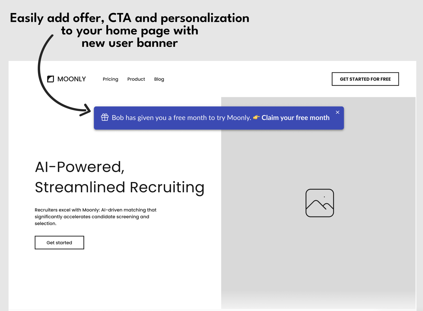 Examples of landing pages with new user banner
🔗 MeetGeek Website with personalized new user banner
Get started now
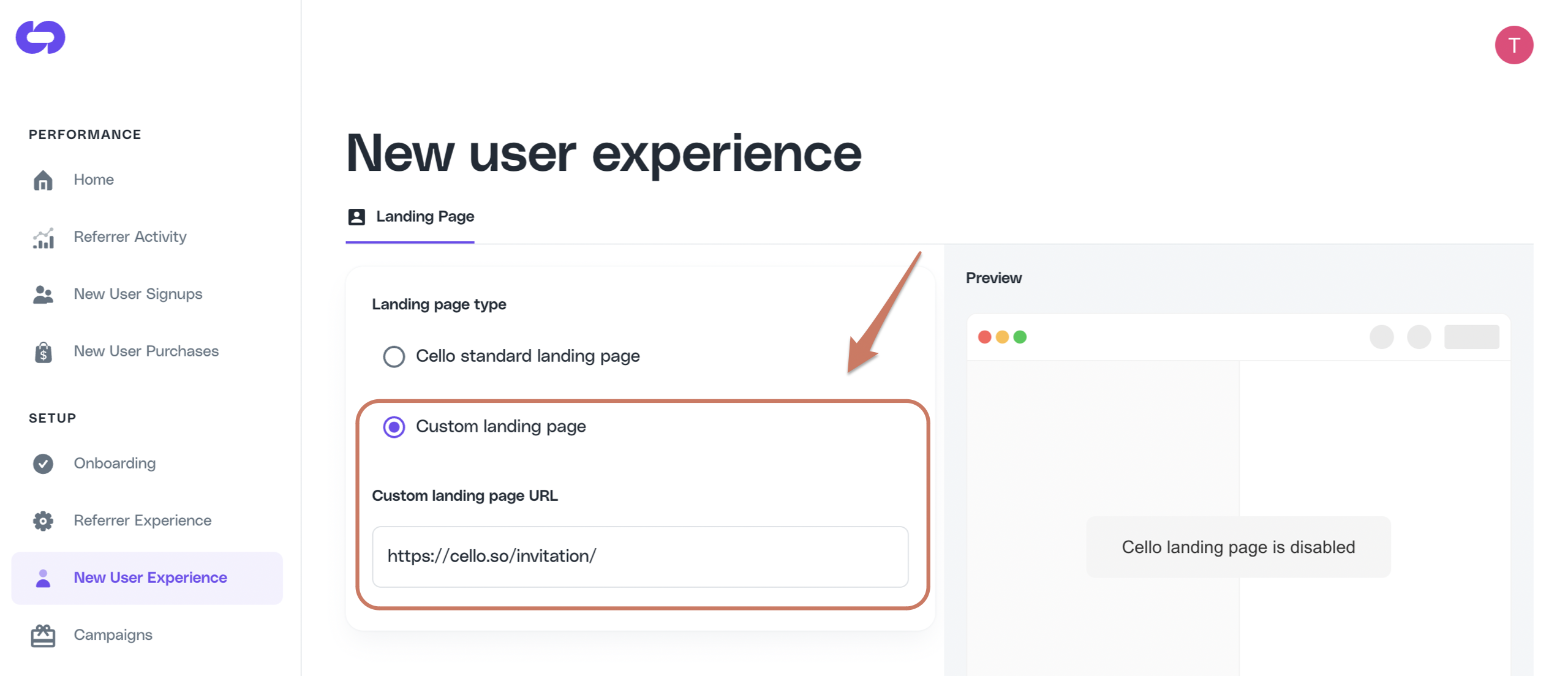
Once your referral landing page is ready to go, go to you product dashboard New User Experience setup page and switch to Custom landing page. In Custom landing page URL field, add the URL to your new landing page and Save.