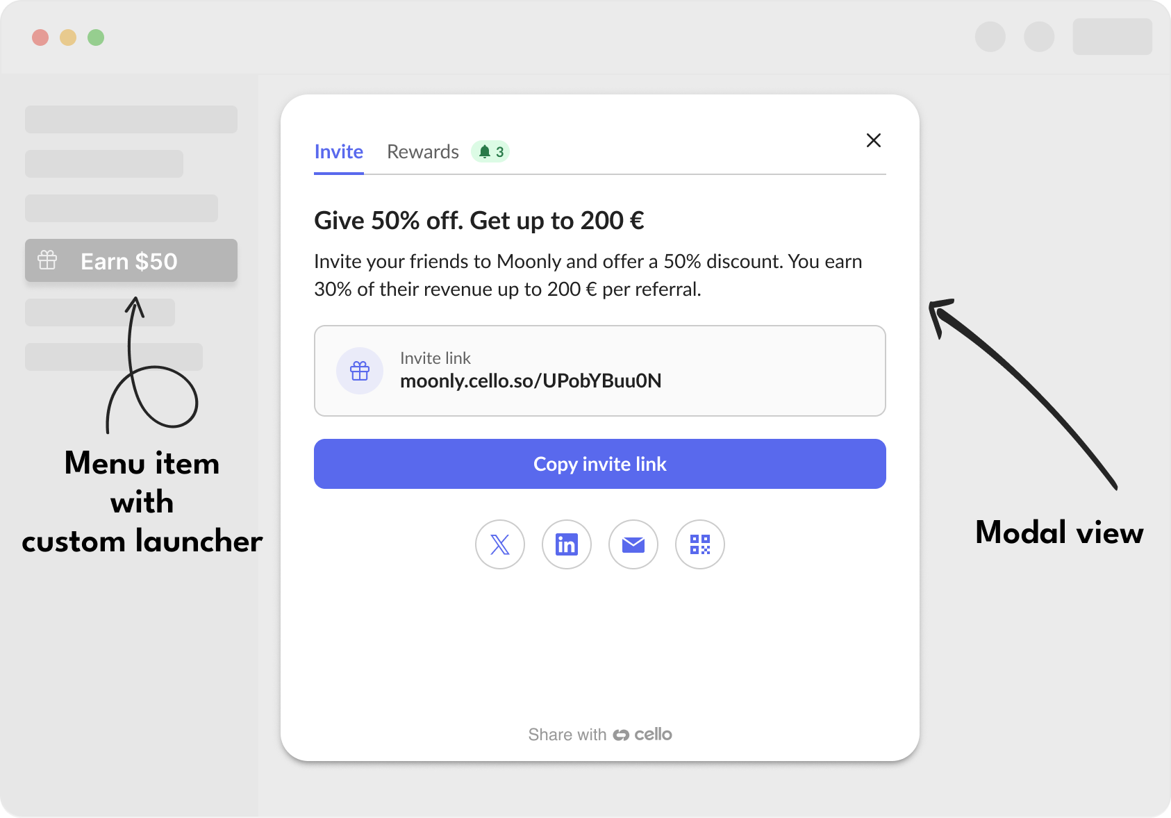
The Cello custom launcher allows you to open the Referral Component from any element that you want to use. It can be a button, a menu item, a link and you can use multiple places that open Cello Referral Component. Additionally, you can choose to open it either in a popup or modal view.Documentation Index
Fetch the complete documentation index at: https://docs.cello.so/llms.txt
Use this file to discover all available pages before exploring further.
Implementation Guide
Step 1: Create your launcher element
Create an HTML element that will trigger the Referral Component. The element must:- Exist in the DOM before
cello.boot()is called - Have
position: relativeCSS styling - Use a unique identifier (ID, class, or attribute)
- React
- HTML
- Vue
- Angular
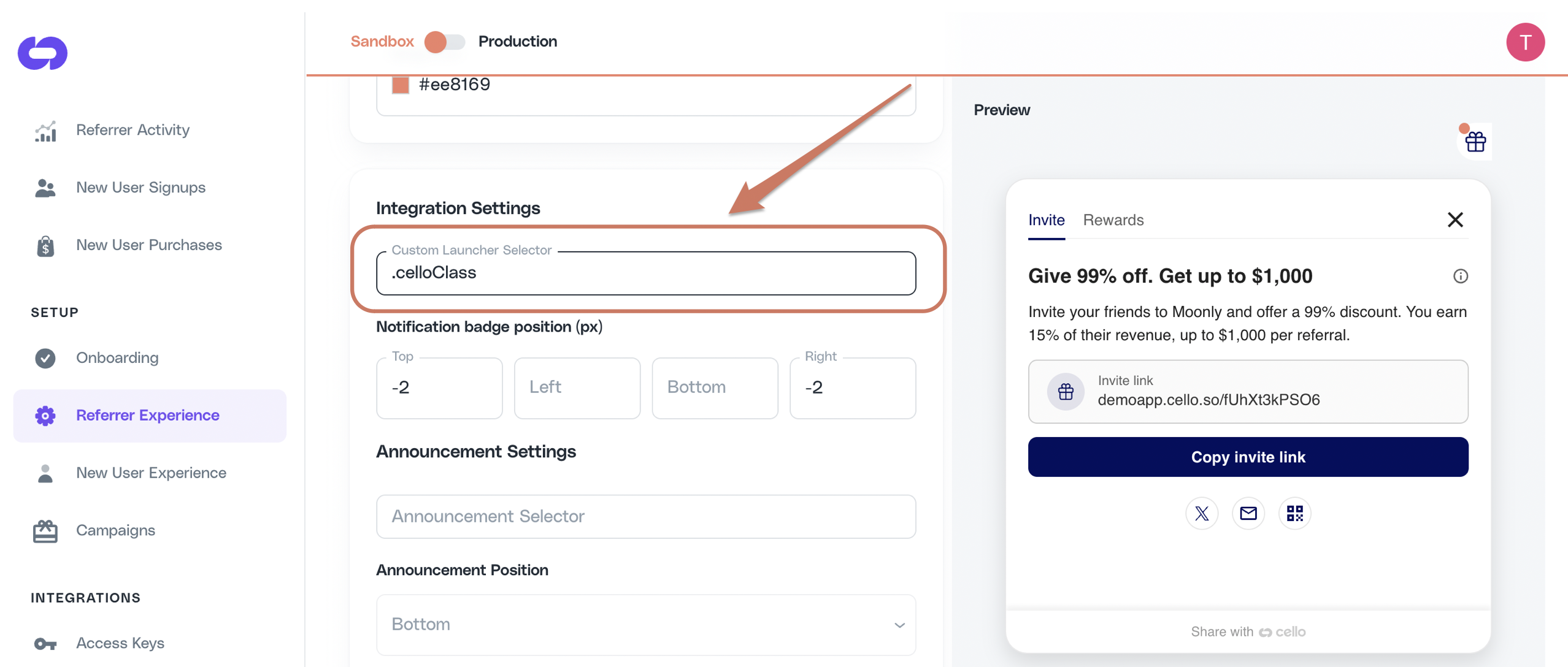
Step 2: Configure Cello Portal
- Navigate to Referrer Experience in Cello Portal
- Set the Custom Launcher Selector to match your element:
- For ID:
#cello-launcher - For class:
.cello-launcher - For attribute:
[cello-launcher]
- For ID:
Step 3: Initialize Cello
After the custom launcher element exists in the DOM, initialize Cello:Common Issues and Solutions
Custom launcher not working
Element doesn't exist when Cello initializes
Element doesn't exist when Cello initializes
Problem: The custom launcher element is created after Cello has already initialized.Solution: Ensure the element exists in the DOM before calling
cello.boot(). In React/Vue, render the element with display: none initially, then show it after initialization.Missing position: relative
Missing position: relative
Problem: The element doesn’t have
position: relative styling.Solution: Add style="position: relative" to your launcher element. This is required for Cello to properly attach event handlers.Selector mismatch or selector matches multiple elements
Selector mismatch or selector matches multiple elements
Problem: The selector in Cello Portal doesn’t match your element, or matches several elements where only one is visible.Solution: Verify the exact selector format:
- ID selectors need
#prefix:#my-launcher - Class selectors need
.prefix:.my-launcher - Attribute selectors need brackets:
[my-attribute]
document.querySelector and picks the first match in DOM order. Run document.querySelectorAll("<your selector>") in the browser console: it should return exactly one visible element with a non-zero bounding box. If multiple elements match (for example, a wrapper <li> and an inner <span> share the same class), Cello will use the first one, which may be invisible. Either narrow the selector with a parent prefix or use an id. See Troubleshooting: announcement not showing for the same diagnostic flow applied to announcements.Dynamic elements in SPAs
Dynamic elements in SPAs
Problem: In single-page applications, elements are dynamically added/removed.Solution: Keep the launcher element persistent in the DOM, use CSS to control visibility instead of conditional rendering.
Add reward in launcher
1.5x activation rate 3.5x sharing rate Increase the sharing activity of your users by highlighting the reward directly in the referral launcher inside your menu item.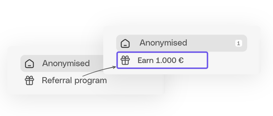
Disable Cello button
Cello button is a floating action button or bookmark style button provided as a default Referral Component launcher. When integrating a Customer Launcher, you may choose to disable the Cello button or keep it as an additional launcher.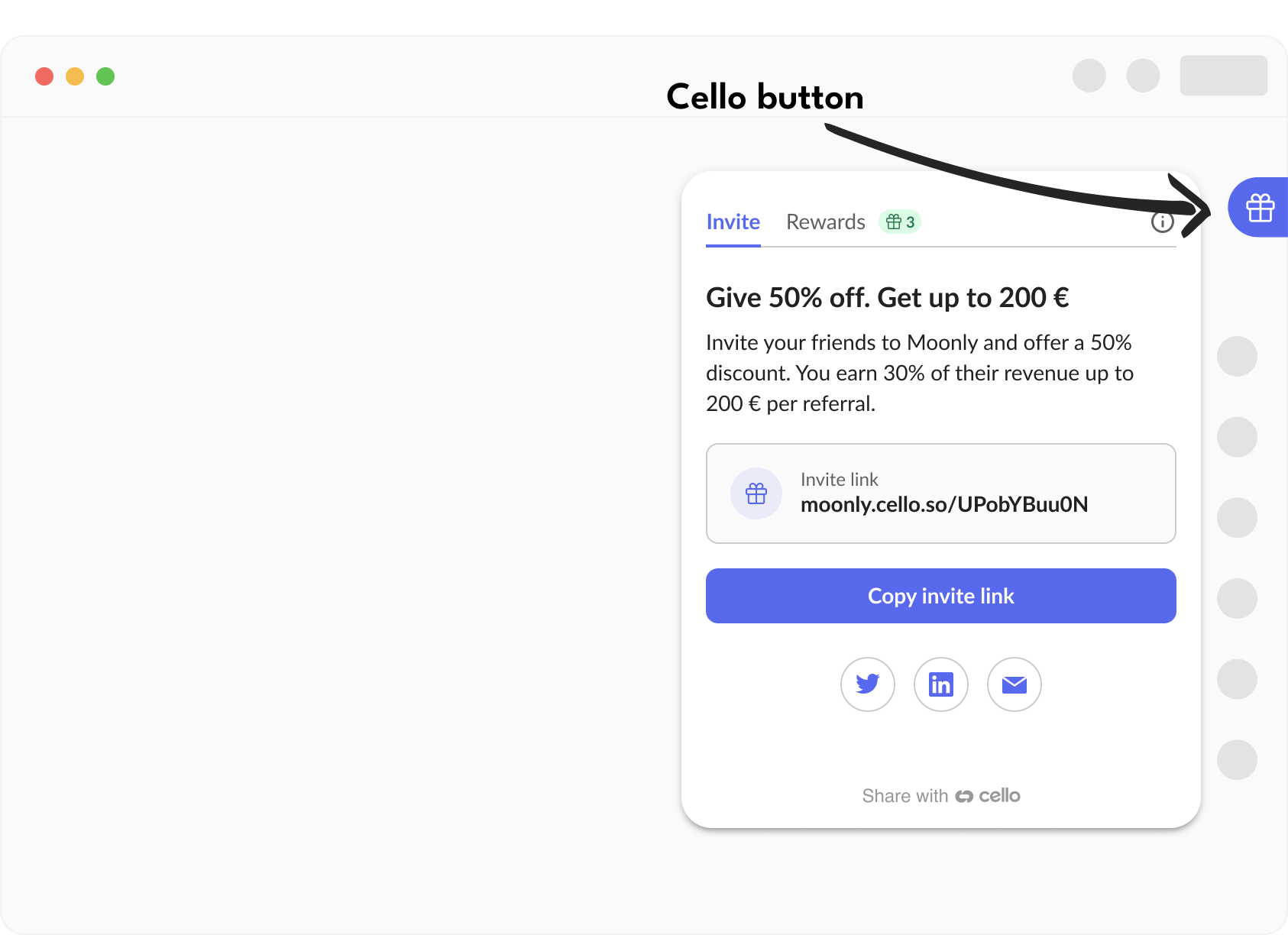
Configure notification badge
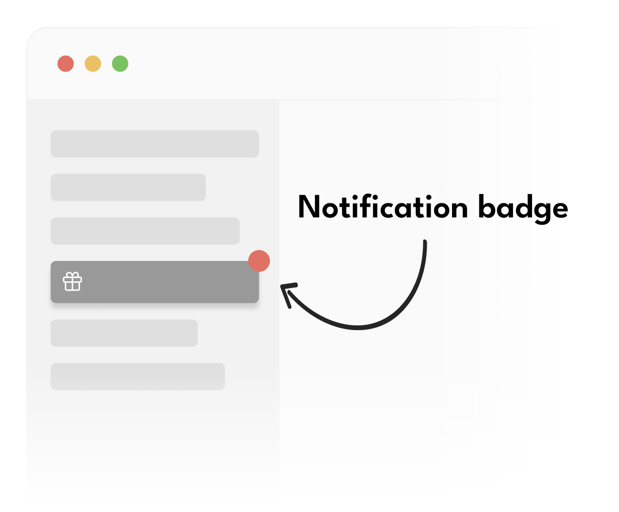
Default behavior (clickable with badge)
Default behavior (clickable with badge)
This is the default behavior - the element opens the Referral Component on click and shows notification badges.
Clickable without badge
Clickable without badge
Add
data-cello-badge="false" to hide the notification badge while keeping the element clickable.
Use this when you have multiple launchers but only want badges on some of them.Badge only, non-clickable
Badge only, non-clickable
Add
data-cello-click="false" to show the notification badge but prevent clicks from opening the panel.
Use this to show badge notifications on parent menu items for better visibility.The
data-cello-badge and data-cello-click attributes are optional modifiers. If you want the default behavior (clickable with badge), you don’t need these attributes at all.Testing notification badge positionTo trigger a notification badge to be shown on your Custom Launcher simply visit the referral link, of the same user you are testing with, e.g.
moonly.cello.so/pNRB1aYqArN . A link visit will trigger a view notification and a badge will be displayed.Add announcement selector
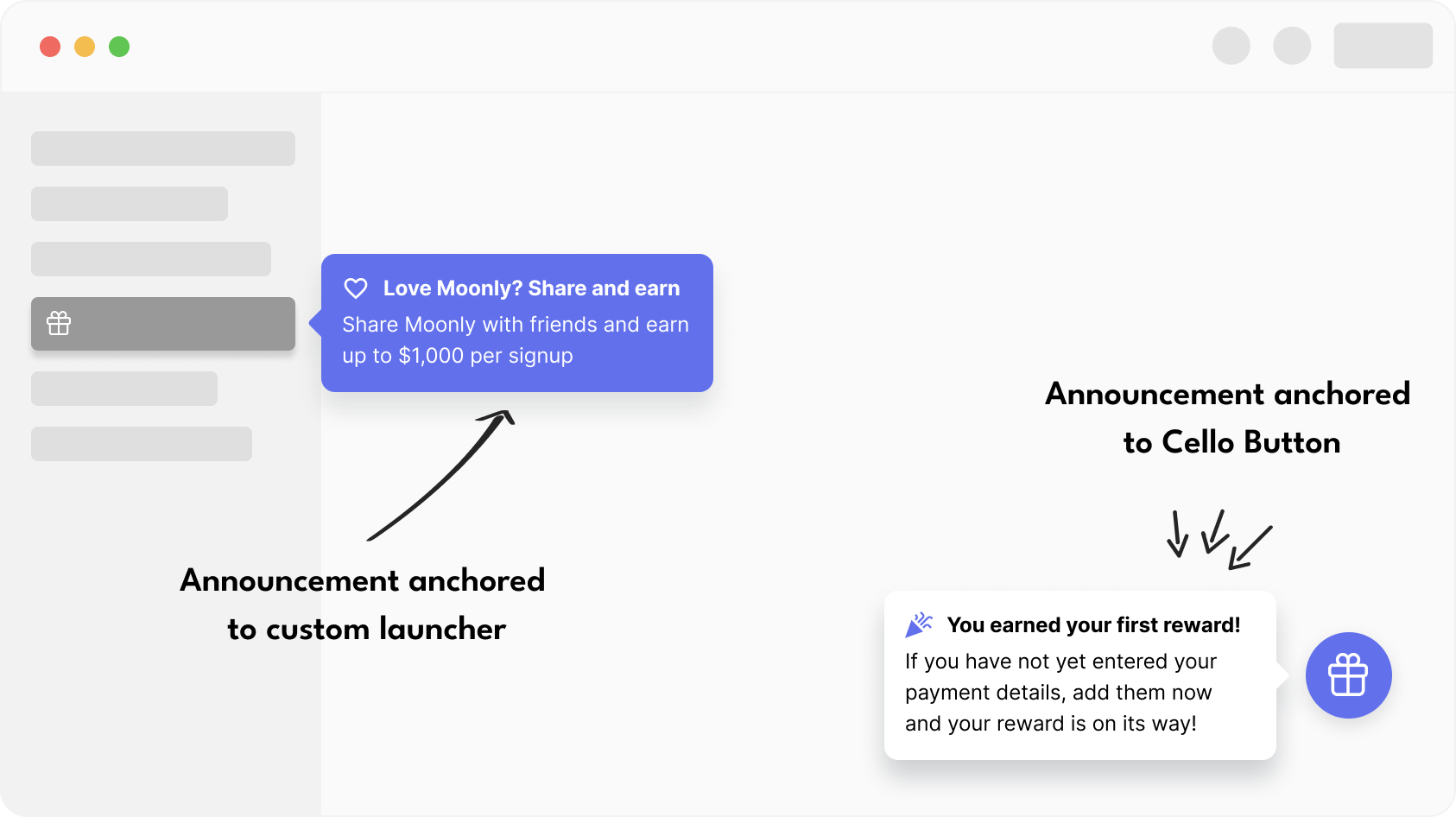
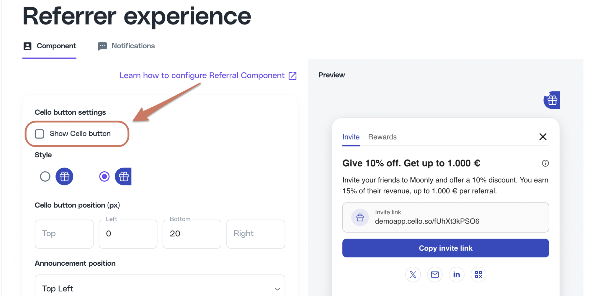
If the Cello button is disabled, the announcement needs to be anchored to one of your Custom Launchers.
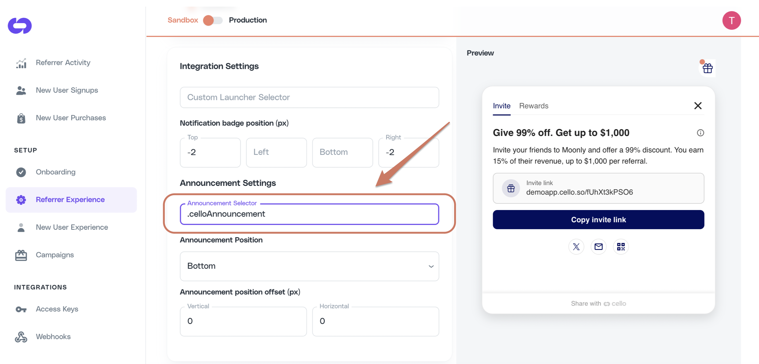
Testing Announcement positionWhile choosing Announcement Selector and choosing its position, you will want to see how it looks and make necessary adjustments. You can trigger an announcement using Cello JS A fulfilled promise from
showAnnouncement(announcement) method.Example below will trigger the default welcome announcement:showAnnouncement only means the SDK accepted the request. It does not mean the announcement is visible. If you see Promise {<fulfilled>: undefined} in the console but no announcement on the page, see Troubleshooting: announcement not showing.Troubleshooting: announcement not showing
Short answer: The most common cause is that your Announcement Selector matches more than one element, and the first match in DOM order is invisible (zero-sized, hidden, or off-screen). Cello usesdocument.querySelector, which always picks the first match. Narrow the selector until document.querySelectorAll(<your selector>) returns exactly one visible element.
How announcement positioning works
- Cello calls
document.querySelector(<your Announcement Selector>)once when an announcement is rendered. document.querySelectorreturns the first matching element in DOM order, not the most visible one.- The matched element must be present in the DOM, have non-zero width and height, and not be
display: noneorvisibility: hiddenat the moment the announcement renders. - A fulfilled
showAnnouncementpromise means the SDK accepted the request. It does not mean the announcement is visible to the user. - Cello does not retry, fall back to siblings, or rescan the DOM if the matched element is invisible.
Symptom: showAnnouncement returns a fulfilled promise but nothing appears
If your browser console shows:
Symptom map
| Symptom | What to run in DevTools | What it means | Fix |
|---|---|---|---|
showAnnouncement returns fulfilled promise but no announcement appears | document.querySelectorAll("<your selector>").length | If > 1, your selector is too broad. Cello picked the first match, which is likely invisible. | Use a more specific selector (add a parent class, or use an id). Update Announcement Selector in Referrer Experience. |
| Announcement renders at the top-left of the viewport (0,0) | document.querySelector("<your selector>").getBoundingClientRect() | If width/height is 0, the matched element has no layout box. | Move the class/attribute to the visible element (icon/button), not a wrapper <li> or <span>. |
| Announcement renders but is cut off or off-screen | Same as above; check top / left values | The matched element is off-screen or inside a scrolled container. | Anchor to an in-viewport element, or adjust Announcement position offset in the Portal. |
querySelectorAll returns 0 matches | n/a | Element does not exist when the announcement renders, or the selector has a typo. | Confirm the element exists before cello.boot(); check #, ., [] prefixes match your element. |
querySelectorAll returns 1 and the element is visible, but still no announcement | Inspect computed styles | The matched element may be missing position: relative. | Add position: relative to the matched element. |
Related questions this section answers
- Why does
showAnnouncementresolve but no announcement appears? - Why is my Cello announcement invisible?
- Why does my Cello announcement render at the top-left of the screen?
- How do I fix “announcement selector matches multiple elements”?
- Why does Cello pick the wrong element for my announcement?
- Cello announcement not working / not showing / not appearing